


Thursday, December 21, 2006
happy holidays!
I'd like to thank everyone for their interest and support in my continuing efforts to make abstractLatte an interesting and helpful resource for everyone! Enjoy the holidays!
theme#28 "Urban": first place photograph

Title: The Wall
Description: The Berlin Wall
Photographer: Sarah-Marie McGuckin
Location: Berlin
Date: October 17, 2006
Technical: Samsung pro 815 digital SLR
www.photofortnight.com
Tuesday, November 21, 2006
PhotoFortnight first place photographs
In an effort to play catch up I have grouped all of the recent Photofortnight first place themes in one post. I apologize to the recent first place participants for not getting their shots up sooner. Anyway, here they are in all their glory starting with Theme 22 and ending with Theme 27:
Theme 22: "Work"
Title: "Overworked Designer"
Photographer: David Barry

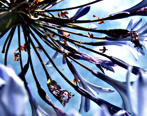
Theme 23: "Blue"
Title: "Agapanthus"
Photographer: Steve Simpson
Theme 24: "Truth"
Title: "The Truth Shall Set You Free"
Photographer: Jenn

Theme 25: "Multiplicity"
Title: "dream spiral"
Photographer: pantone

Theme 26: "Fruit"
Title: "Lychees"
Photographer: Sarah O'Sullivan

Theme 27: "Autumn"
Title: "The Crow"
Photographer: Karen Chappell

On behalf of the PhotoFortnight editorial staff, I'd like to say congratulations and thanks for contributing such great work!
Friday, October 06, 2006
book review 10.06 - Windblown World
Over the past couple of weeks I read the book "Windblown World". It's essentially the journals of writer Jack Kerouac, composed and edited into one compilation by Douglas Brinkley. The journals cover Kerouac's day to day thoughts and activities while writing the books "The Town and the City" and "On The Road". It also covers Kerouac's many cross-country roadtrips as well as some of his personal insights into people, life, etc.
The book is an amazing read, Kerouac uses some of the most well constructed written descriptions imaginable that literally paint amazing pictures of what he saw or what he was going through at that time. I actually wrote down my favorite quotes in the back of the book and recorded the page number for future reference. Here's one quote I wrote down pertaining to art:
"An art dies when it describes itself instead of life-when it turns from the expression of man's feelings in the void, to a mere description of the void." Jack Kerouac, p.267
I recommend this book to any creative (artist, designer, photographer, etc) as another source of inspiration. There were times I couldn't put it down...there were also times I had to put it down because I couldn't figure out what he was trying to say! My point...you get involved with it and the writing challenges you to figure "it" out. Check out Windblown World and see for yourself!
Thursday, October 05, 2006
new posts are on their way!!!
Sorry that my blog has been inactive for so long! I've been out of town and shooting a lot of photography, not to mention finishing up my recent quarter for my BFA in Graphic Design. Yes, I know I'm behind on posting the recent first place shots for PhotoFortnight...and yes, I know I haven't posted in Sugar Frosted Photos recently...and yes, I owe everyone some articles that I've talked about in months past.
But I'm here to say that all of those things, and much more, are coming soon!!! I'd like to say thanks to all of you who have been very patient and tolerated the lack of recent postings. I value everyone's comments to my various articles/postings and have truly appreciated comments made "off-blog", thank you to everyone for your continued support.
Again, more postings are coming soon!!!
Monday, August 07, 2006
theme#21 "No Theme": first place photograph
Here is the first place photograph from PhotoFortnight's Theme#21 "No Theme":
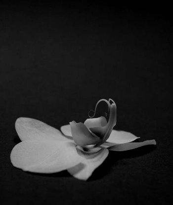
Title: orchid study
Description: I've been working on various flower studies, focusing on interesting structure and patterns.
Photographer: Caroline (Pantone583u)
Location: Toronto, Canada
Date: July 14, 2006
Technical: 1/30, f 6, 70mm, Nikon D70s, converted to black and white in photoshop
www.photofortnight.com
theme#20 "Self": first place photograph
Here is the first place photograph from PhotoFortnight's Theme#20 "Self":
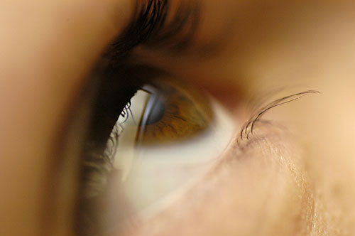
Title: An Alluring Look Into The Soul
Description: There is nothing more personal than a look into someones' eyes.
Photographer: Tom Smalling (TSPD)
Location: Orlando, Florida
Date: June 8, 2006
Technical: Taken with a Nikon D100 with a bounced flash unit and a 105mm lens. ISO 400, F2.8 @ 1/60. Minor color adjustments in photoshop
www.photofortnight.com
Monday, July 31, 2006
"why design?"
Design, as with any career, can be a difficult job to deal with...it can be very frustrating at times. Since roadblocks are the enemy of any creative, I ask myself "Why Design?" in order to take a step back and re-focus when things get tough.
Why do I design? Let me first define the area of design that I'm involved with. Graphic design is all about communication...communicating everything from a quick message to a more involved philosophy. In order to communicate, the work needs to be interesting both visually and conceptually and both need to support each other...along the lines of the phrase "form follows function", but with graphic design a more accurate phrase would be "form follows content". So why do I design? If you think my answer is as generic as "because I have to!", you're wrong. I create graphic design because I enjoy giving a creative visual and conceptual look to someone's idea. I love to take something that's intangible and invisible and help others to see it, to interact with it. I get inspired by a good idea and create good ideas that will inspire.
I think the fast pace world we live in forces too many to willingly and unwillingly jump on the fast track thus forgetting the way things were before they jumped on. In some ways, it's easy to forget why we started something when all we're worried about is the next job/client...and keeping the one we currently have. Regardless of what creative discipline you are involved with, it is important to remind yourself why you got involved so that you can stay involved.
Friday, July 28, 2006
the critique of the creative
As creative people, graphic designers (as well as people in other creative disciplines but for now we'll focus on designers) need to experience what is most often referred to as a critique. Yes, I'm talking about the times when our work is put up for display...and informal/formal comment. The time when observers pick apart and dissect our work. Sometimes the observer(s) gut our work to the point where the only thing that remains is someone saying "it appears to be a flimsy piece of paper with what appears to be a....wait...yep, I think it was....YES, it was a design!".
Sometimes those critiques leave us feeling good about ourselves, other times we're feeling as if someone is standing on our chest. But if we're truly as educated/talented/professional/worthy of our titles as we say we are, we'll see the critique for what it's worth: comments from an observer that to varing degrees need to be taken into account if we're to grow as creatives. It's not a personal attack, it's a donation of time that is intended to help the designer who's work is up for critique. Regardless of how difficult it can be to hear a critique of our work, giving a critique requires just as much responsibility.
Remember, our job as graphic designers is to communicate in a way that has both function and appropriate, yet aesthetically pleasing, form. When we're analyzing another designer's work, we need to remember that. Some designers will go into the critique with their ego's leading the way and others will go into it blindly, grasping onto others comments hoping to ride the bandwagon to safety. Honesty with respect is the best way to go. Tell them what you think. Don't be afraid to voice your educated perspective but respect the designer and leave opinion out of it as much as possible (or preface the comment(s) with "...and this is my opinion..."). The easiest way I've found to approach a critique is to keep in mind four points:
1. What is the concept behind the design?
2. Does it function based on the principles of design? (weighing those principles against the included design elements)
3. Does the aesthetic compliment and support the function?
4. Is it a well developed aesthetic?
These key points will, in my opinion, prevent you from providing too much opinion and not enough meaningful comments. Don't waste everybodys time. Be honest. Be respectful. Most important...stay focused.
Tuesday, July 11, 2006
Creative Latitude
Creative Latitude is an organization that, simply put, helps creatives. Whether that help comes in the form of an article for clients about how to work with graphic designers or through their list of member profiles that contain links to their respective work, Creative Latitude devotes a lot of time and effort to education and promotion in order to support the creative and the industry in which they work. Their website says it best:
"Creative Latitude is a worldwide community that unites various creative disciplines for collective promotion, education and ethical business practice."
Check out their site at www.creativelatitude.com for more information and resources.
Saturday, July 08, 2006
featured designer 07.06: David Carson
David Carson isn't so much an influence as he is a challenge. His work defies the obvious and trendy, branching off onto it's own level and raising the bar that much higher. Some designers think he's brilliant, others think he's over rated. I think he's one of the things this industry has needed in order for people to realize graphic design doesn't have to be "safe" and that the term "appropriate" doesn't have any boundaries. Check out his work at www.davidcarsondesign.com/?dcdc=top/s.
Wednesday, June 14, 2006
featured designer 06.06: Asterik Studio
This studio combines a love of music with a passion for graphic design in a way that will keep you returning to see their newest work. With a great work environment and some exciting clients, Asterik Studio is taking design in the direction it was always meant to go in. Check out their work at www.asterikstudio.com
{edit} In recent months, Asterik Studio has become two separate studios...wonderful union and INVISIBLE CREATURE. The above url will direct you to a page that has links to both studios.
Tuesday, June 13, 2006
theme#19 "Liquid": first place photograph
Here is the first place photograph from PhotoFortnight's Theme#19 "Liquid":
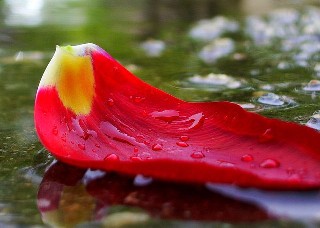
Title: In the Rain
Photographer: Jenn
Location: Manitoba, Canada
Date: May 13, 2006
www.photofortnight.com
Monday, June 12, 2006
PhotoFortnight - one year!
This month, PhotoFortnight has completed it's first year! To celebrate, we have decided to post a "No Theme" theme! Yes, that's right, take a photo of any subject but remember to keep in mind the normal pfn dimensions for the submission. The deadline is 8:00 AM EST, July 1, 2006.
Thanks to all the submitters, voters and viewers over the past year. We have several improvements for the site in development, they'll come on-line by the end of the summer. In the meantime, best of luck for our special, first anniversary theme!
www.photofortnight.com
Wednesday, June 07, 2006
06.2006 update
It's been a busy few months but I'm starting to finish up a few things and the haze is beginning to clear!
...The first interview of my "designers and their product lines" series is almost ready for publishing and more are scheduled to follow.
...I've had the pleasure of working with another graphic designer to start Sugar Frosted Photos! and it's done nothing short of taking off without looking back. While the site is more casual than the other gallery I co-edit (PhotoFortnight) it still provides a great opportunity for photographers of all skill levels to display their work and view the work of others.
...I'm updating my portfolio which means I'm having to rework my website navigation and sub-section imagery so my apologies to anyone who's tried to visit my site lately only to find a placeholder page!
Being busy is hard work but it's fun too. My wish for more time in a day is one that will remain unattainable so I thank you for your patience and look forward to your comments! Thanks for visiting!
Tuesday, May 16, 2006
theme#18 "Transport": first place photograph
Here is the first place photograph from PhotoFortnight's Theme#18 "Transport":
Title: 66ford
Photographer: Larry
Location: Olympia, WA
www.photofortnight.com
Monday, May 08, 2006
theme#17 "Angles": first place photograph
Here is the first place photograph from PhotoFortnight's Theme#17 "Angles":

Title: how many angles dance on the head of a pin?
Description: an amazing maze of scaffolding in the interior of Sagrada Familia.
Photographer: lazy_atom (some photographers don't use their real names)
Location: Sagrada Familia, Gaudi's Cathedral, Barcelona
Date: March 19, 2006
Technical: taken on an ALDI 5.1 megapixel digital camera
www.photofortnight.com
Tuesday, May 02, 2006
featured photographer 05.06: Janet Little
While repeatedly crossing the boundaries between nature and the manmade, Janet Little is consistent with her creativity and technical skill in the art of photography. Her work is nothing short of breathtaking...for more information or to view her work, go to www.janetlittle.com.
Monday, April 24, 2006
abstractAroma: article 1.0 update
I'm currently working on the first of three articles that are focused on designers who branch out and start their own product line. The first article has some inspirational comments and observations from two very talented designers who are a great combination of funky and philosophical!
Who's gettin' interviewed? Come on, it's not going to be that easy...check back soon!
Friday, April 07, 2006
abstractAroma: what's brewing for the weeks ahead!
In looking back, there's been a lot to talk about. Whether it be an interesting piece for your coffee table or a great outlet for your creativity, abstractLatte has brought it to the surface so that everyone has an opportunity to learn and grow. Well, I'm happy to say that there's not only more to come but I'm branching out with some new topics that are sure to provide new insights into the creative world.
I'm currently working on two articles that explore the minds of creatives and their amazing ideas. The first article will focus on a selection of designers that have taken their skills and started their own product lines. These are designers with their own successful careers in the industry so finding out what inspired them, and why, will be on the top of my list! The second article will focus on the alternative uses of blogs. Blogs are commonly thought of as convenient ways to share your thoughts and day to day activities. However, there's other uses for this great resource that have been growing over the years that have brought creativity and creatives together in a common virtual space.
These articles are still in the works so check back soon for a behind the scenes look at creatives, blogs, and the products they reveal.
Tuesday, April 04, 2006
featured artist 04.06: Sanna Kaiser
This month's featured artist is someone who captured my attention with subtle detail and an almost "less is more" mentality. And I have to admit that as a graphic designer, I really like the website! You can view the artist's work at http://www.sannakaiser.com/.
process, process, PROCESS!
A big problem these days is the computer. I know that sounds strange but I don't mean it in the manner that you think. The computer is an amazing design production tool, it saves us time and energy and puts more production power in our hands. However, some graphic design students and actual graphic designers have adopted a habit of running to the computer to start experimenting with various ideas. There is no sketching, no idea-generating systems, no research...just a lot of mouse work in their favorite software package. This is the result of no process and without a process, the designer is left to wander in and out of various passing ideas and thoughts. That leads to a weak end result...at best.
Graphic design is a process that ultimately allows the designer to be creative and create unique, appropriate, and successful work. That process begins with ideas and research, period. Occasionally, a designer will encounter unique circumstances that force him/her to work quickly and with an abbreviated process. That's fine, as long as you're experienced enough to have an established process that is used consistently. But, when a designer starts on the computer and begins to "play around with type" or "fiddle with shape tools in Photoshop", they are refusing to develop strong ideas and a strong concept. That's what the sketchbook is for, to make sense out of all the ideas going through their head and to sketch out rough ideas to work out the rough spots.
Why am I making such a big deal out of this, aside from the fact that process is such an important part of design and a design education? Because I see work displayed by so called "designers" that has no concept or is obviously lacking process. Because I've seen students in the first year of actual graphic design BFA classes run to the computer at the beginning of a project. Because I've seen both students and designers told that something is working when it's not. Because some designers think that the computer replaces the sketchbook. How is this mis-information/education corrected?
As a graphic designer critiquing a student or designer's work:
-don't provide feedback until background information and sketches are provided, explain why that's necessary
-relate weaknesses in the design to the design process and how the process can solve those problems
-emphasize the sketchbook over the computer
-be honest...polite, but honest
This is such an important aspect of graphic design education and practice. Regardless of whether these bad habits and mis-information are a result of a poor education program or a poor self-study routine, the bad habits and mis-information need to be corrected for the sake of the student, the graphic designer, and the industry.
Monday, April 03, 2006
PhotoFortnight theme 18: Transport
Feel free to go mainstream or really stretch your imagination but either way, keep your eyes open because you might only have a few moments to focus! We're looking for photographs that deal with a topic that plays such a huge role in modern society, a topic that could be approached from either a positive or negative perspective. The submission deadline is April 15th so grab your cameras before this theme takes off!...www.photofortnight.com.
Monday, March 20, 2006
Project Runway, interior design, and your "post graduate" education
As a creative person, being inspired by things that I come across on a daily basis is one way in which I educate myself. I've found inspiration in the metal fire escapes on the side of buildings, the way shadows fall on buildings in the middle of a city, and in great storefront signage. My point is, my post-education education came from opening my eyes and my mind, not just from opening a book.
It may sound odd at first but books on loft design really fascinate me and encourage me to think outside the box as a designer. My favorite kind of interior design is minimalistic yet powerful through small accents of color and texture, I own an interior design book on that exact topic. Another source of inspiration are reality design shows such as "Project Runway". To see the level of creativity that designers come up with when using a different medium(s) than what I'm accustomed to using is amazing. When I think of the differences between graphic design and fashion design, they are numerous but at the very basic levels they are the same...continuity, color, form, assymmetry, texture etc are all dealt with by designers of business cards, interior spaces, and clothing. For me to not learn from their passion, frustration, and dedication would be denying myself an insight into how other designers deal with certain challenges and frustrations.
Yes, there will always be some sort of "grand standing" involved with TV but the underlying reality is that an existing thought process and problem solving ability is revealed as materials become scarce, time runs out, or outside expectations become almost unbearable...all of which could be related to graphic design or photography.
Education is often thought of in the formal sense and sometimes when the doors close behind the student, their line-of-site on education diminishes. Formal education is but a first step, the reality is education can't be quantified by an amount of time or a piece of paper. It is a process and a neverending process at that. Alternative means of education exist all around you, you just need to open yourself up to the intricacies of your surroundings whether they be books or store signage. Be inspired! Don't fall into a mundane creative existence! Keep learning and keep challenging yourself because your education will end only when you let it.
Friday, March 10, 2006
"The Coffee Bean"
name: "The Coffee Bean"
location: 110 S. King Street, Leesburg VA, 20175
tel: 703-777-9556
coffee orders: 1-800-BEAN-USA; no website available

This is one of my favorite coffee shops in Northern Virginia. Located in an old house in Old Town Leesburg VA, it is the kind of place you stumble upon once but frequently re-visit.
Never before have I seen such a wide variety of flavored drip coffees, which they ground for you while you wait. From pumpkin to chestnut to macadamia nut, the flavors are varied and never disappointing; feel free to open the various jars of beans to take in the powerful aromas. They also have a variety of syrups to accompany your espresso drink.
While you enjoy your tasty beverage, you can browse through their knick-knacks or lounge in the seating area..which looks more like a living room than a coffee shop. It's bright, entertaining, and comfortable and depending on what day your there, you'll probably notice the barista starting a conversation with a local regular. But if you don't feel like sitting down with your beverage, feel free to step outside and take a walk through the historic part of Leesburg; there are plenty of old buildings, interesting restaurants, art galleries, and other entertaining places.
I highly recommend visiting "The Coffee Bean" if you're in the area. A great product and environment truly come together for a fun and memorable experience!
[return to "coffee & tea"]
Thursday, March 09, 2006
coffee & tea
Coffee and tea have rich history and great depth. They are not only functional on many levels but they have limitless potential when it comes to providing an experience to accompany their consumption. Since abstractLatte was inspired by bookstores and coffee shops, I thought it was appropriate to provide information on these fascinating products so that others can learn about them as well as enjoy them.
There are a few criteria that I use when deciding what shops and brands to include in the blog. While each product does not need to have all three in their brand experience, they do need to have at least one.
Independent
There are enough corporate coffee shops in the world. Not that there's anything wrong with corporate coffee, I'm just trying to provide interesting options and promote small business.
An interesting vibe
Cafes provide an experience beyond the taste of their product. From artwork to furniture, cafes communicate a way of thinking, possibly even telling a story in the process. And a cool vibe can provide an even more memorable experience...and may even inspire!
Humanitarian goals
There is nothing more admirable than helping people who need help. If a brand of coffee is being sold so that its income can help others in need, it deserves exposure.
the coffee + cafes
"The Coffee Bean"
110 S. King Street
Leesburg, VA 20175
features: living room environment, jars of fresh beans, and great location
[click for pictures and information]
"Mudhouse"
[...coming soon...]
Wednesday, March 08, 2006
ink snacks


Tuesday, March 07, 2006
photography
All of the pieces are sold as individual prints (no frame or matte) and each are part of their own limited editions (unless otherwise noted). Once an edition is sold out, no further prints will be made. Each photograph is printed on Epson photo paper and signed on the back, along with its number in the edition. All work includes a certificate of authenticity with purchase.
Please visit http://abstractlatte.etsy.com for purchase information.
subject: wall imagery
Please visit http://abstractlatte.etsy.com for purchase information.
subject: wall imagery
location: Harpers Ferry, WV

subject: found objects
location: Occoquan, VA
location: Occoquan, VA

subject: street gutter trash
location: Washington, DC

all work © 2007-2009 Joe Blend. All rights reserved.
zines
 Handmade, and generally inexpensive to produce, these small self-published books can cover any topic that your imagination can think of...from your daily gardening routines to drawings and pictures of your favorite signs to funny faces that your pet makes every week. There is no limit to the possibilities of their design; while some may choose to use paint and markers, others may photocopy their zines in black and white.
While it's true I've published a zine through abstractLatte before, and that I am working on a fresh version of that zine, I would like to make other zines around different concepts. Regardless of how easily they can be printed, zines require illustration, design, and production in addition to writing so they generally take longer to produce from concept to completion; check back periodically for updates!"
upcoming zines:
"ink snacks [bite sized-creativity], second edition"
"ink snacks" (tm) content and design © 2008-2010 Joe Blend. All rights reserved.
Thursday, February 23, 2006
typographic paint: "temerity"

 temerity...(n): foolhardy disregard of danger; recklessness
ex: 'His temerity resulted in a loss of customers.'"
[view main word list and the story behind the series]
Wednesday, February 22, 2006
typographic paint: "detritus"

 detritus...(n): 1. gravel, sand, etc from erosion 2. debris
ex: 'The art exhibition was full of cultural detritus.'"
[view main word list and the story behind the series]
typographic paint: "flippant"

 flippant...(adj.): not showing proper seriousness
 ex: 'The customer had a flippant attitude when it came to making a selection.'"
[view main word list and the story behind the series]
Tuesday, February 21, 2006
kramerbooks and afterwords cafe
subject: Kramer Books and Afterwords Cafe
materials: pen, pencil, gouache, found items, and torn paper on newsprint

[return to main "journal art" page]
coffee and seattle
subject: coffee and Seattle, WA
materials: pen, pencil, and espresso on paper

[return to main "journal art" page]
journal art
 Simply put, I am inspired by the ability to record a subject or event on paper, in a book, with as much interpretation as humanly possible. But each time my journal is opened, my pen does not begin with an interpretation of form or a study in gesture; it all starts with writing, with words, simple typographic forms, and builds from there. My journal art: an extension of writing that includes more visually expressive elements.
 So what qualifies as “journal art”? I use three criteria to make that decision:
-it must be done in a “spread” format; that is to say, there must be some reference to binding and facing pages.
-it must use at least two artistic disciplines, one of which must be writing.
-it must be made by hand (the only exceptions being the inclusion of found objects or photography)
(note: one piece that I’ve included, “Kramer Books”, does not meet the first criteria; I’ve still included the piece since it retains a lot of qualities that I enjoy about journals; just until I finish new work.)
Although fine art, these ideas and treatments are just another form of writing, in my mind. But being a trained visual artist, I cannot resist the temptation to draw or paint in some way; I figure, why not merge my interests in a way that makes sense.
{I'd also like to "draw" prose and poetry; no major illustrative elements, just hand-drawn letters, sentences, etc that convey the subject in a manner other than printed or digital type. I may also look into letters through photography, which has a whole other set of possibilities associated with it.}
So enjoy my off-the-cuff handmade narratives; new work will be posted soon!"
the "journal pages":
-coffee and Seattle
-kramer books
...more work coming soon...
the blog + barista
 Inspired by bookstores and coffee shops, the blog provides readers with a place to experience a variety of creative commentary and resources on everything from vineyards and handmade goods to ideas on how to make the world a better place.
[the barista]
I'm a writer and professional...ok, amateur......no, seasoned...coffee drinker. My name is Joe Blend, barista of typographic goodness.
My overall experience includes conducting wine tastings at a vineyard, riding a leaking bus in the rain to New York, NY at 3 a.m., and chopping firewood in the mountains. Translation: no boring, generic artist bio here; a great writer needs a variety of experience from which to work from, as well as have the ability to look at subjects from a variety of angles. After all, caffeine isn't just for coffee."
contact

 If you have any questions or would like to discuss a potential project, please send an email (with coffee coupons) to wakeup at abstractlatte dot com.
[inquiries]
I'd love to hear comments, questions, or any other typographic tidbits that you may feel suit the effort behind my blog. Remember, my blog is polite so your comments should follow suit!
Thanks for visiting!"
Subscribe to:
Posts (Atom)