I don't remember how I discovered journals. When I finally decided to invest both money and time into one, it started out as a source for inspiration. I would cut out images and whole articles, gluing them onto the pages and adding my own notes. My journal process moved to drawings, then writing, and now it's a combination of everything.For some reason, I never finished a journal. What happened is I started using it and realized after a month or even a few months that the book wasn't accomodating my needs. My journals have included the following:a purchased leather journal - about 6"x9", with a leather tie that wrapped around the journal a few times to keep it closed...{concern}...too big and became too heavy as more collaged elements/pages developedhandmade/retail hybrid, version 1 - front/back cover and spine of a watercolor sketchbook, with thread-bound signatures of newsprint...{concern}...I did a poor job of binding and the signatures were too heavy for the paper, it was also too uncomfortable to usehandmade/retail hybrid, version 2 - front/back cover and spine of a watercolor sketchbook with a handmade accordion pocket inside with various types of paper...{concern}...it was annoying to pull out and return individual pieces of paper, cut out articles, etc using the accordion pocketmoleskine - 3"x5", too small...didn't last longhandmade - handmade paper cut into two pieces for the front and back cover, contained different types of paper, bound with binding screws...{concern}...too fragileWell, I've finally found one that I consistently enjoy! It is, in a lot of ways, the best parts of my previous journals. I think what I like best about this one is its flexibility and simple binding.current journal - relaxed leather for the front/back cover and spine, bound by a strip of leather tied off at both ends, contains different types of paperdetails: when I purchased it, I took out most of the paper it contained and began my quest for custom paper. I cut pages out of newsprint, charcoal paper, packing paper, and white drawing paper (as well as used some of the paper it came with); I cut the sheets in a sloppy manner on purpose, inspired by the deckled edges of my old watercolor sketchbook.Once i punched holes in all the pages, I re-bound the journal. Now I had a custom journal with a variety of papers. And once I fill this journal, I can re-bind it with new papers and re-use the leather cover/spine as many times as I want.Here are a few shots of some of my favorite pages...cover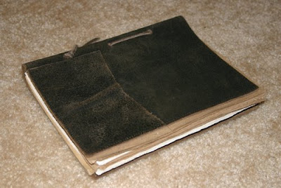 first page
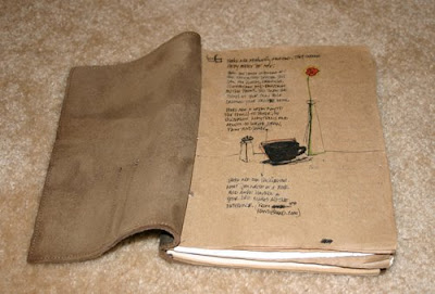 random writing
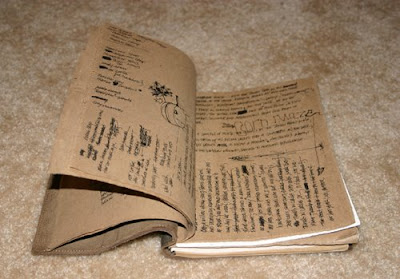 random drawings
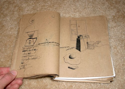 For those of you that don't use journals, I recommend you start. You don't have to be an artist, designer, writer, etc to use a journal. If you enjoy traveling, going to antique stores, or enjoy keeping track of various activities, a journal can be a fun and personal way to accomplish that; it's also interactive so more than one person could use the same journal.
Although there are a number of places to purchase a journal, it all depends on what you want. Here are some helpful links to get you started:
Handbound.com
My Handbound Books
Barnes and Noble
Borders
Etsy
Cavallini & Co.
journal content © 2008 joe blend. All rights reserved.


